
I Catalogued Forty-Seven Production Incidents Over Six Months. Six Patterns Explained Forty-One of Them.
What I learned by writing down every outage I worked on, organized by shape rather than cause.

The 2:43 AM page told me the checkout flow was failing.
I opened my laptop with one eye closed and the dashboard with the other. P99 latency on the payments endpoint had climbed from 280 milliseconds to 4.2 seconds in fifteen minutes. Error rate was 8 percent and climbing. Customer support had already pinged the engineering Slack with seven tickets.
The database CPU was at 23 percent. Memory was fine. Disk I/O was unremarkable. The slow query log had nothing dramatic. I queried for active connections.
HikariCP showed ten connections in use. The pool size was ten. Connection acquisition timeout was firing across the entire application.
That was the visible bug.
I spent the next forty-seven minutes finding the real bug, which was a query that was holding connections for eight seconds each because it was making a synchronous call to a third-party fraud API inside a transaction. The pool was not too small. The connections were being held too long.
The fix was three lines of structural change. Move the third-party call out of the transaction. Add a circuit breaker. Done.
Forty-seven minutes to find a three-line fix.
A few days later I told the senior engineer on the team about the incident over coffee. He nodded. He said: “Yeah, the pool-that-was-not-really-a-pool problem. That one is about a five-minute diagnostic once you have seen it twice. Took me four hours my first time.”
That conversation changed how I thought about production engineering.

I started writing down every incident I worked on after that conversation.
I am three years into a backend engineering career. I have been on a real on-call rotation for two of those years. Between January and June of 2026, I logged forty-seven incidents in a Notion database. Each entry had the same fields. Symptom. What I initially suspected. What the actual root cause was. How long it took to find. The underlying shape of the failure.
After about thirty incidents, I started noticing something. The symptoms were always different. The root causes were always specific. But the shapes underneath were a small set.
I went back to the catalog and tried to classify each of the forty-seven incidents into recurring shapes.
Six shapes covered forty-one of them.
The remaining six were genuinely unique. A kernel panic on a specific GPU instance type. A race condition in a third-party SDK that the vendor fixed in a patch release. Four other one-offs.
But the forty-one. The forty-one were shapes I had now seen multiple times each. And once I named them, I started recognizing them in real time.
The first time I saw the connection-pool-that-looked-like-slow-database, it took me forty-seven minutes. The fourth time, it took eleven. By the seventh time, I called it inside ninety seconds and the diagnostic was a single SQL query.
That is what pattern recognition does. It is not magic. It is not intelligence. It is a small library of failure shapes that you have absorbed because you have seen each one enough times to know what it looks like at 3 AM with a coffee that has not kicked in yet.
This is what senior engineers have. Not more vocabulary. Not more abstract knowledge. A specific library of shapes they have memorized.
Below are the six shapes that explained forty-one of my forty-seven incidents. Each one comes with a war story, the visible symptom, the real underlying cause, the diagnostic order, and the actual fix.
If you have been on call for any meaningful time, at least three of these will be immediately recognizable.
If they are not, the cost of reading this carefully and absorbing the shapes is roughly zero. The cost of learning them the slow way, one incident at a time, is approximately ten years.
Pattern One: The Connection Pool That Looked Like a Slow Database
The war story
2:43 AM. Endpoint P99 climbing from 280ms to 4.2 seconds. Database CPU at 23 percent. No slow queries in the log. HikariCP showing pool exhaustion.
For thirty-five minutes, I was sure the database was slow. I ran EXPLAIN ANALYZE on every query the endpoint touched. They all looked fine. I checked the slow query log. Nothing dramatic. I opened the database monitoring dashboard. CPU, memory, disk, replication lag, all normal.
I was looking at the wrong layer.
The shape
The endpoint was making a synchronous call to a third-party fraud detection API inside a Spring transaction. The third-party API had degraded from 200ms to 8 seconds. Every endpoint request was now holding its database connection open for the full duration of the third-party call, because the transaction did not release the connection until commit.
With ten connections in the pool and incoming requests at 30 per second, each holding a connection for 8 seconds, the math was simple. The pool saturated in the first three seconds and stayed saturated.
The database was fine. The pool was not really a pool. It was a queue with ten slots and an eight-second service time.
The visualization
Request lifecycle (broken):
  [acquire conn]──[db query 50ms]──[third-party call 8000ms]──[db commit 5ms]──[release]
                                   ▲▲▲▲▲▲▲▲▲▲▲▲▲▲▲▲▲▲▲▲▲▲▲▲▲
                                   connection held but not used

Pool view at 2:43 AM:
  Connection 1: held by req #847  ████████ (6.2s in third-party call)
  Connection 2: held by req #862  ███████  (5.4s in third-party call)
  Connection 3: held by req #871  █████    (4.1s in third-party call)
  ...
  Connection 10: held by req #891 ██       (1.8s)
  Connection 11: WAITING (no pool slot)
The diagnostic
The single query that tells you whether the pool is the problem or the duration is the problem:
SELECT
  count(*) as active_connections,
  max(extract(epoch from now() - state_change)) as longest_held_seconds,
  max(extract(epoch from now() - query_start)) as longest_query_seconds
FROM pg_stat_activity
WHERE datname = 'production'
  AND state = 'active';
If longest_held_seconds is significantly higher than longest_query_seconds, the connection is being held for something other than database work. That is the signal.
SELECT pid, state, wait_event_type, wait_event, query
FROM pg_stat_activity
WHERE datname = 'production'
  AND state = 'active'
ORDER BY query_start ASC;
If wait_event_type shows Client or IPC instead of IO or Lock, the connection is not waiting on the database. It is waiting on the application doing something else.
The fix
// BEFORE: third-party call inside transaction
@Transactional
public OrderResult processOrder(Order order) {
    Customer customer = customerRepo.findById(order.customerId());
    FraudCheckResult fraud = fraudApi.check(order); // 8 seconds. Connection held.
    if (fraud.isOk()) {
        return orderRepo.save(order);
    }
    throw new FraudDetected();
}

// AFTER: third-party call outside transaction
public OrderResult processOrder(Order order) {
    FraudCheckResult fraud = fraudApi.check(order); // No DB connection held.
    return persistOrder(order, fraud);
}

@Transactional
protected OrderResult persistOrder(Order order, FraudCheckResult fraud) {
    Customer customer = customerRepo.findById(order.customerId());
    if (fraud.isOk()) {
        return orderRepo.save(order);
    }
    throw new FraudDetected();
}
Three lines of structural change. The third-party call moved out of the transaction boundary. The connection now held for the actual database work, not for the wait on a remote system.
The shape, named
External work inside a transaction. The framework provides a connection. The connection stays open until the transaction commits. The duration of the transaction equals the duration of the slowest synchronous thing inside it.
If you see pool exhaustion with low database load, the answer is almost never “increase the pool size.” The answer is “find what is holding connections for longer than the work they are doing.”
I have now seen this exact shape eight times in three years. Different databases. Different frameworks. Same shape.
Pattern Two: The Memory Leak That Looked Like a Load Problem
The war story
The pod restarted on Friday at 6:14 AM. OOMKilled. Memory limit 1 gigabyte. The application was supposed to use around 600 megabytes.
I checked Grafana. Memory had been climbing for four days. From 290 megabytes Monday morning to 950 megabytes Friday. The slope was linear.
Engineering manager’s first question: “Are we just getting more traffic?”
Traffic graphs over the same week were flat.
This was not a load problem. This was a leak.
The shape
Memory leaks in long-running JVM applications are almost never about “load.” They are about references that survive longer than they should. Most commonly:
A static collection that grows without bound
A
ThreadLocalthat never clearsAn event listener registered but never deregistered
A cache with no eviction policy
A
ClassLoaderthat holds references after redeploy
In this case, the team had recently added a feature that logged user activity into a thread-local map for batch flushing. The flush never happened on threads that did not handle the specific endpoint. The map grew. Every request added a few kilobytes. Four days at 30K requests per hour produced an 800 megabyte leak.
The visualization
Heap usage over 4 days (the unmistakable leak shape):

  1GB ┤                                            ╱  ← OOM kill
      │                                        ╱╱
      │                                    ╱╱
      │                                ╱╱
      │                            ╱╱
      │                        ╱╱
500MB ┤                    ╱╱
      │                ╱╱
      │            ╱╱
      │        ╱╱
      │    ╱╱
      │╱╱
      └─────────────────────────────────────────────
       Mon    Tue    Wed    Thu    Fri

Compare to traffic over same period (flat):

  1K rps ┤━━━━━━━━━━━━━━━━━━━━━━━━━━━━━━━━━━━━━━━━━
         └─────────────────────────────────────────
          Mon    Tue    Wed    Thu    Fri

Memory climbing linearly while load is flat = leak.
Memory climbing with load = legitimate sizing problem.
The diagnostic
Configure the JVM to dump heap on OOM, then trigger the failure deliberately if you have to.
# In Dockerfile or kubernetes spec
-XX:+HeapDumpOnOutOfMemoryError
-XX:HeapDumpPath=/var/log/heap-dumps/
Once you have a dump, open it in Eclipse MAT or VisualVM. Sort by retained size, not shallow size. Retained size tells you how much memory would be freed if this object were garbage collected. The leak almost always shows up as a single dominator path that retains 80 percent or more of the heap.
The senior engineer’s diagnostic order on a memory leak:
Confirm memory grows over time independent of load
Get a heap dump near OOM (not at startup)
Sort by retained size
Trace the dominator path
Look for static collections,
ThreadLocal, event listeners, unbounded caches
The fix
// BEFORE: ThreadLocal that grows without flush
private static final ThreadLocal<Map<String, Activity>> activityBuffer =
    ThreadLocal.withInitial(HashMap::new);

public void logActivity(String userId, Activity a) {
    activityBuffer.get().put(userId, a);
    // No periodic flush. The map grows forever on threads that never
    // hit the flushing code path.
}

// AFTER: bounded buffer with periodic flush
private static final int MAX_BUFFER_SIZE = 100;
private static final ThreadLocal<LinkedHashMap<String, Activity>> activityBuffer =
    ThreadLocal.withInitial(() -> new LinkedHashMap<String, Activity>() {
        @Override
        protected boolean removeEldestEntry(Map.Entry<String, Activity> e) {
            return size() > MAX_BUFFER_SIZE;
        }
    });

public void logActivity(String userId, Activity a) {
    var buffer = activityBuffer.get();
    buffer.put(userId, a);
    if (buffer.size() >= MAX_BUFFER_SIZE) {
        flushAsync(buffer);
        buffer.clear();
    }
}
The shape, named
Code accumulating references it does not need. Load is irrelevant. The shape is “growth over time uncorrelated with traffic.” When you see it, raising the memory limit does not fix anything. It delays the death.
I have seen this shape six times. Twice it was ThreadLocal. Twice it was an event bus subscription that survived service redeployment. Once it was a Guava cache without an eviction policy. Once it was a Spring @Cacheable with no TTL.
Pattern Three: The N+1 That Looked Like a Frontend Bug
The war story
The user dashboard endpoint started taking 2.5 seconds. It used to return in 180 milliseconds.
The frontend team filed the ticket. The dashboard was slow. Frontend was sure it was a backend problem. Backend was sure it was a frontend problem. The graphs showed nothing unusual on the database or the application server.
I turned on Hibernate SQL logging in a staging environment and replayed the request.
The endpoint executed 312 SQL queries.
The shape
Two weeks earlier, the team had added a LastLoginAt field to a UserPreferences entity. The dashboard endpoint returned a list of 312 user objects. For each user object, JPA was now lazily loading userPreferences to populate the lastLoginAt field on the response DTO.
One query to fetch the users. Three hundred and eleven additional queries to lazy-load preferences. Three hundred and twelve total.
The endpoint was not slow because the database was slow. The endpoint was slow because it was doing three hundred times more database work than it needed to.
This is the classic N+1 query problem. It is the most under-monitored production failure in the JPA ecosystem because no individual query is slow. Each is a 1-2 millisecond keyed lookup. The problem is the multiplication.
The visualization
What the developer thought was happening:

   Request ──► [1 query: SELECT users] ──► Response (180ms)

What was actually happening:

   Request ──► [1 query: SELECT users]
            ──► [1 query: SELECT preferences WHERE user_id = 1]
            ──► [1 query: SELECT preferences WHERE user_id = 2]
            ──► [1 query: SELECT preferences WHERE user_id = 3]
            ──► ... 308 more queries ...
            ──► [1 query: SELECT preferences WHERE user_id = 312]
            ──► Response (2500ms)

Each lazy load:   1-2ms
Total queries:    312
Total DB time:    312 × 2ms = 624ms
Network overhead: 312 round trips × ~5ms = 1560ms
Object hydration: ~300ms
                  ─────
Total:            ~2500ms

The database was not slow.
The roundtrips were the problem.
The diagnostic
If you suspect N+1, count queries per request. The single most useful debugging configuration in a Spring Boot service:
# application.yml
spring:
  jpa:
    properties:
      hibernate:
        generate_statistics: true

logging:
  level:
    org.hibernate.SQL: DEBUG
    org.hibernate.stat: DEBUG
Replay the suspect request. Watch the log. If a single endpoint executes more than a handful of queries, something is wrong.
For production diagnosis without log spam, use Micrometer metrics with a query counter per request span. If average queries per request crosses ten, alert.
The fix
// BEFORE: lazy-loaded relationship causes N+1
@Entity
public class User {
    @Id Long id;
    String email;

    @OneToOne(fetch = FetchType.LAZY)
    @JoinColumn(name = "preferences_id")
    UserPreferences preferences;
}

// In the repository
List<User> findAllActive() {
    return userRepo.findByActiveTrue();
}

// In the DTO mapping
List<UserDashboardDto> dashboard = users.stream()
    .map(u -> new UserDashboardDto(u.getId(), u.getEmail(),
                                   u.getPreferences().getLastLoginAt())) // Lazy load!
    .toList();

// AFTER: explicit fetch join eliminates N+1
@Query("""
    SELECT u FROM User u
    JOIN FETCH u.preferences
    WHERE u.active = true
""")
List<User> findAllActiveWithPreferences();

// Or use EntityGraph
@EntityGraph(attributePaths = {"preferences"})
List<User> findByActiveTrue();
The shape, named
An invisible loop generating queries. The code looks like a single operation. The database sees three hundred. The shape applies anywhere an ORM, GraphQL resolver, or repository abstraction can hide query generation behind property access.
I have seen this shape eleven times in three years. It is the most common failure shape I cataloged. Spring Boot 3.5 added automatic detection through Hibernate 6.5’s bytecode analysis, but the pattern still ships into production regularly because the detection is opt-in and most teams have not turned it on.
Pattern Four: The Retry Storm That Made the Recovery Slower
The war story
The third-party payment provider had a partial outage. They were returning 503 errors on roughly 40 percent of requests for about twelve minutes.
By the time their incident was fully resolved on their side, our incident was just starting.
Our payment service had been configured with five retries on 5xx errors, with linear backoff of one second between attempts. When the third-party started returning 503s, our service amplified the load on their recovery by retrying every failing request five times. And then, when their recovery briefly accepted requests, those retries hit them in a thundering herd because every client had been queueing retries with the same one-second cadence.
We extended their outage by approximately four minutes by helpfully retrying. We then extended our own service’s degradation by another fifteen minutes because the retries had backed up our own thread pool.
The shape
When a downstream dependency degrades, the wrong retry policy turns one outage into two. The shape:
Downstream slows down or starts failing
Your service retries every failed request
Each retry adds load to the downstream during their recovery
When downstream briefly recovers, all queued retries hit at once
Downstream goes back down
Your service’s thread pool fills with retries
Your service degrades even though the downstream is now recovering
The single most expensive retry behavior in production is “retry without backoff and without jitter.” The single most expensive retry mindset is “more retries means more reliability.”
The visualization
Without exponential backoff (cascade amplification):

Third-party state:   [degraded ─── recovering ─── stable]
                        ▲              ▲             ▲
Our requests:        ──┼──┼──┼──┼──┼──┼──┼──┼──┼──┼──┼──
Retry attempts:      ────████████████████████████──────
                          ▲▲▲▲▲▲▲▲▲▲▲▲▲▲▲▲▲▲▲▲▲▲
                          stampede during their recovery


With exponential backoff + jitter (clean recovery):

Third-party state:   [degraded ─── recovering ─── stable]
                        ▲              ▲             ▲
Our requests:        ──┼──┼──┼──┼──┼──┼──┼──┼──┼──┼──┼──
Retry attempts:      ──█──█────█──────────█───────────
                       └─┴─0.5s──┴─2s──────┴4s──── jittered

Third-party gets time to actually recover.
Our service does not pile up retries during the degradation.
The diagnostic
Look at the retry pattern as a curve, not as a number.
// Logging that lets you see retry storms in your own metrics
@Component
public class RetryMetrics {
    private final Counter retryAttempts;
    private final Counter retrySuccesses;
    private final Counter retryExhausted;

    public void recordAttempt(String endpoint, int attemptNumber) {
        retryAttempts.tags("endpoint", endpoint, "attempt", String.valueOf(attemptNumber))
                     .increment();
    }
}
If attempt_2 and attempt_3 rate climbs above ~10 percent of attempt_1 rate, you are in a retry storm.
The fix
// BEFORE: linear retries, no jitter, no circuit breaker
@Retryable(value = HttpServerErrorException.class,
           maxAttempts = 5,
           backoff = @Backoff(delay = 1000))
public PaymentResult charge(PaymentRequest req) {
    return restTemplate.postForObject(PAYMENT_URL, req, PaymentResult.class);
}

// AFTER: exponential backoff with jitter + circuit breaker
@CircuitBreaker(name = "paymentProvider", fallbackMethod = "chargeFallback")
@Retryable(value = HttpServerErrorException.class,
           maxAttempts = 3,
           backoff = @Backoff(delay = 500, multiplier = 2, random = true))
public PaymentResult charge(PaymentRequest req) {
    return restTemplate.postForObject(PAYMENT_URL, req, PaymentResult.class);
}

public PaymentResult chargeFallback(PaymentRequest req, Exception e) {
    queueForLaterProcessing(req);
    return PaymentResult.deferred(req.getId());
}
Three retries instead of five. Exponential backoff with random jitter. Circuit breaker that trips when the failure rate crosses a threshold. Fallback that queues the request for later processing instead of failing the customer.
The shape, named
Retries during a partner outage amplify the problem. The default reaction to “downstream failing” is to retry more aggressively. The correct reaction is to retry less, with jitter, with a circuit breaker, with a graceful fallback.
I have seen this shape five times. Three times it was a payment provider. Once it was an SMS provider. Once it was an internal service that had become a single point of failure.
Pattern Five: The Deploy That Passed Every Test and Broke Production
The war story
A clean Tuesday afternoon deploy. All tests passed. Canary looked fine for ten minutes. Error rate started climbing at minute twenty-eight. By minute thirty-five, the new version was clearly broken in production.
The bug was a feature flag that defaulted to “off” in tests and was configured as “on” in production. The code path enabled by the flag had a latent bug that only fired against the real production database schema, which had a column the test fixtures did not.
The tests had been written. They had passed. The code was correct in every environment we tested. It was wrong in the only environment that mattered.
This is the most insidious failure shape because the system reports success. Tests pass. Canary completes. Dashboards stay green. And then customers find the bug first.
The shape
Environmental drift. The thing that ships is not exactly the thing that runs. The drift can come from:
Feature flags with different values per environment
Database schemas that differ between staging and production
Configuration values that override defaults in some environments
Environment variables that change behavior
Network policies that exist in production but not staging
Data shape that differs (test fixtures vs real production data)
Cache state that is cold in staging and warm in production
Third-party API quotas that allow staging but throttle production
The Cloudflare R2 incident on March 21, 2025, was a perfect example of this shape. New credentials were deployed to a development instance instead of production. The old credentials were then deleted as part of the rotation. The result was 100 percent of writes failing for 67 minutes.
The bug was not in the code. The bug was in the gap between environments.
The visualization
What the team tested:
                            ┌──────────────────┐
   PR ──► CI tests ──► Stg ──► ████ tests pass │ ──► Approve deploy
                            └──────────────────┘
                              feature_flag = OFF
                              schema = v3.2
                              data = test fixtures

What actually ran:
                            ┌──────────────────┐
   Deploy ──► Production ──► ░░░░ bug fires    │ ──► Customer impact
                            └──────────────────┘
                              feature_flag = ON
                              schema = v3.2 + column from migration #847
                              data = 47M real rows including 12K edge cases

The gap between "what was tested" and "what ran"
is where most deploy failures live.
The diagnostic
Pre-deploy gates that catch environmental drift before code reaches production:
# Sample deploy gate config
pre_deploy_gates:
  - name: schema_diff
    check: production_schema_hash matches code_schema_hash
    block_if: mismatch

  - name: feature_flag_parity
    check: all_flags_have_explicit_production_value
    block_if: any_flag_uses_environment_default

  - name: config_audit
    check: production_config_diff_against_staging
    block_if: undocumented_difference

  - name: canary_metrics
    duration: 30m
    check: error_rate_within_baseline AND latency_p99_within_baseline
    block_if: deviation_beyond_threshold
This is not glamorous engineering. It is the kind of work that nobody notices when it succeeds and everybody blames when it fails.
The fix
The fix is not a code change. It is a process change. The team that deploys without these gates is the team that finds environmental drift through customer pain.
Concrete defaults I now insist on for any new service:
Explicit feature flag values per environment in version-controlled configuration, never relying on a default
Schema migration parity check before deploy
Shadow traffic on production data for high-risk changes
Configuration diff audit between staging and production at every deploy
Canary duration based on traffic shape, not on a fixed timer (28 minutes was the wrong canary window for this incident; the bug fired at 28 minutes)
The shape, named
The thing that shipped is not the thing that runs. Every difference between environments is a potential failure mode. The cost of finding these differences before deploy is engineering hours. The cost of finding them after deploy is customer trust.
I have seen this shape seven times. Twice it was feature flags. Twice it was schema drift. Once it was a configuration override. Once it was network policy. Once it was real production data shape that staging did not represent.
Pattern Six: The Green Dashboard During Real Customer Pain
The war story
The dashboards were green. Synthetic monitors were succeeding. P99 latency was at baseline. Error rate was within normal range.
Customer support was on fire.
For two hours we were sure customer support was overreacting. The system metrics were unambiguous. Then a senior engineer asked one question: “What endpoint specifically are customers using when they hit the failure?”
Customer support relayed back: “They are trying to update their billing address.”
We checked the billing address update endpoint specifically. It had a 73 percent error rate. The synthetic monitor for billing was hitting a different endpoint (the read path). The aggregate dashboards averaged the broken endpoint with the rest of the traffic and called it “1.4 percent error rate,” which was below the alert threshold.
The dashboards were green because they were measuring the wrong thing.
The shape
Monitoring that measures system health instead of customer health. This shape shows up in several variations:
Dashboards that aggregate across endpoints, hiding the broken one
Synthetic monitors that exercise the read path while the write path is broken
Alerts on system-level metrics (CPU, memory) that say nothing about whether the product works
SLOs measured against availability of the service rather than success of customer workflows
p99 latency reported as the average of multiple endpoints, masking the slow one
The diagnostic question that breaks this pattern: “If a customer logged in right now and tried to do the most important thing they do, would my monitoring tell me whether it worked?”
For most teams, the answer is no.
The visualization
What the dashboards showed:                What customers experienced:

  Overall error rate:  1.4%  ✓               Billing update:    73% errors  ✗
  Avg P99 latency:    340ms  ✓               Checkout flow:     43% errors  ✗
  CPU:                 38%   ✓               Search:           normal       ✓
  Memory:              52%   ✓               Login:            normal       ✓
  Database health:     ok    ✓               Notifications:    normal       ✓

The averages were fine.
The customer-facing flows that mattered most were on fire.
The diagnostic
Customer-flow synthetics, not endpoint synthetics. The synthetic monitor should walk through the actual customer journey:
# Bad: monitors a health endpoint
def check_billing_health():
    response = requests.get(f"{API}/billing/health")
    assert response.status_code == 200

# Good: walks the actual customer flow
def check_billing_address_update_flow():
    user = create_test_user()
    login_response = login_as(user)
    assert login_response.status_code == 200

    update_response = requests.post(
        f"{API}/billing/address",
        json={"line_1": "123 Test St", "city": "TestCity", "zip": "12345"},
        headers={"Authorization": f"Bearer {login_response.token}"}
    )
    assert update_response.status_code == 200

    verify_response = requests.get(
        f"{API}/billing/address",
        headers={"Authorization": f"Bearer {login_response.token}"}
    )
    assert verify_response.json()["city"] == "TestCity"

    cleanup_test_user(user)
The synthetic above takes longer to run, fails more often when something is genuinely broken, and matches the actual customer experience.
The fix
The fix is to design monitoring around customer journeys, not around system components.
A senior engineer’s monitoring layout:
Tier 1: customer-flow synthetics that walk real workflows. Alert on any failure.
Tier 2: per-endpoint error rates with separate alerting thresholds, not aggregated.
Tier 3: system-level metrics for capacity planning, not alerting.
Most teams have only tier 3. Tier 3 is the easiest to instrument. Tier 1 is the only one that actually correlates with customer experience.
The shape, named
Measuring the system, not the product. Green dashboards mean nothing if the dashboards measure the wrong thing.
I have seen this shape four times. Twice it was synthetic monitors covering the read path while the write path failed. Once it was aggregate error rates hiding a single broken endpoint. Once it was an alert threshold tuned to the wrong baseline.
What forty-seven incidents taught me about senior engineering
Six patterns. Forty-one of forty-seven incidents.
The remaining six were genuinely unique. They were the ones I could not have predicted, where I learned something new about a specific technology or vendor or kernel.
But the forty-one. The forty-one were variations. Once I named the shapes, I started seeing them in real time.
The first time you walk into a connection-pool-that-looked-like-slow-database, it takes you forty-seven minutes. The fourth time, eleven minutes. The seventh time, ninety seconds.
The compounding is not metaphorical. It is measurable.
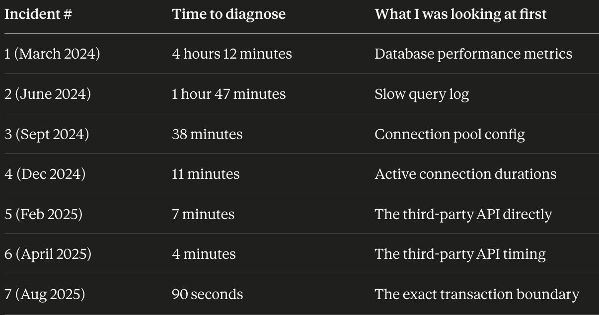
Same shape. Seven incidents. From four hours to ninety seconds.
This is what senior engineers actually have over mid-level engineers. Not vocabulary. Not knowledge of more technologies. A specific library of failure shapes they have absorbed and can recognize.
It is also what AI tools currently cannot do.
AI tools can recognize syntax. They can read documentation and explain it. They can write code that compiles. But pattern recognition under pressure, the kind that turns a four-hour debug into a four-minute one, requires having lived through the pattern multiple times with a specific system and absorbed what it looks like.
The senior engineers in my career who I admire are not the ones who know the most. They are the ones who recognize the shape fastest. The vocabulary is the surface. The patterns are the work.
You can learn the patterns the slow way, by being on call for ten years and accumulating them one outage at a time. The pace is approximately one new pattern per real incident, which means somewhere between three and ten years of real production work to build a usable library.
Or you can borrow the compression.
Where the rest of the patterns live
I have been writing down failure patterns for two years now.
The six in this post are the most common ones I have personally encountered. They are not the only ones.
There are at least twenty more patterns I have catalogued that did not make it into this post for length reasons. Cache stampedes after expiration. Database lock contention that looks like deadlock but is not. Async batch jobs that succeed individually but corrupt data collectively. Container OOMs that are caused by JVM heap miscalibration in cgroups v2. Spring Cloud Gateway that routes correctly in staging and drops requests in production because of one timeout config. Kubernetes pod evictions that happen during pre-stop hooks. The list keeps growing.
I documented twenty-seven of them, organized by layer (incident response, debugging, infrastructure, architecture, AI inference, senior interviews) and bundled them into Production Engineering OS. It is the compressed library that includes the six in this post plus the others.
It is intentionally framework-agnostic. The patterns apply whether you run Spring Boot, Go, Python, or Node. The shapes are not language-specific. They are the shapes that production systems take when they fail.
If your pain is specifically incidents, Production Incident OS is the focused subset of nine incident-layer resources.
If your stack is Spring Boot and the framework keeps lying to you through its defaults, Spring Boot Production OS is the operational layer Spring documentation does not cover.
If you have an interview loop coming up, System Design Interview OS is the communication layer for senior and staff rounds.
If you want the broadest one, Production Engineering OS is the entry.
I priced the flagship at a level that is roughly one engineer-hour for a senior engineer. The first pattern you recognize because you read it here, instead of finding it the slow way in production, pays the library back several times over.
What to do with this post
Forward it to one engineer who is in the trough between mid-level and senior. That is the audience this is written for.
Then go look at your last three incidents. Try to classify each one into a shape rather than a cause. If you cannot find a shape, write down the symptom and the actual root cause and the diagnostic order in a Notion database. Do this for six months.
The pattern library is the work. The framework is the acceleration. The decision is whether you pay for the patterns in years or pages.
The decisions compound. The recognition accelerates.
— Devrim
The first pattern in this post (connection-pool-that-looked-like-slow-database) is one of the case studies fully decoded in Production Incident OS. So are seven others like it.


