


PULLBACKS DURING A TREND
The next screenshot highlights the importance of putting the size of pullbacks into context:
• The first green shaded area shows the first larger pullback during the ongoing downtrend.
• Before that, the pullbacks were relatively small which signaled strong momentum to the downside. Often, strong trends only show sideways ranges instead of real pullbacks.
• A large pullback can foreshadow a broken market structure and it provides first indications of losing trend strength.
• Finally, price failed to make lower lows altogether which had been foreshadowed by the increasing size of pullbacks against the downtrend.


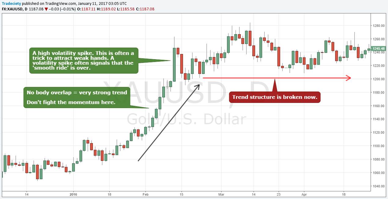
• A trend where candle bodies do not overlap signals strong strength because price keeps going in one direction without pulling back significantly
• When candlesticks show no or only small wicks, it also signals a strong and healthy trend
• Candlesticks are roughly the same size and are not too large. If you see that suddenly candlesticks are becoming very large, it means that volatility is increasing. This often happens when markets approach a top or a bottom
• If you see gaps, especially in the daily timeframe, those gaps don’t close and price keeps trending
4) REJECTED REVERSALS
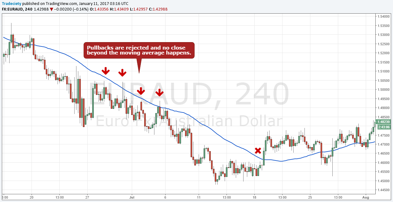
The way failed breakouts and rejected reversals occur on your charts is a big tell as well. Here are the most important patterns and characteristics when it comes to analyzing failed reversals during trends:
• Price does not overshoot trendlines or when it does, it never closes beyond a trendline
• When a trendline breaks, there is only a sideways move and no immediate reversal
• Reversal spikes get immediately rejected and covered
• Pullbacks into moving averages are very quick and price does not stay long at a moving average
5) ADX
The ADX measures trend strength and it is non-directional which means that it cannot tell you
which direction price is going – it only tells you if the trend is gaining or losing momentum.
The chart below shows a downtrend and the first down-movement shows a lot of strength in the
ADX by making a new high and absolute on the ADX. The next two bearish moves were much smaller
and not as strong and the ADX confirmed it by showing lower highs. The last move on the far right showed
a very choppy and narrow movement and the ADX went dipped at that point, the price had entered a range.
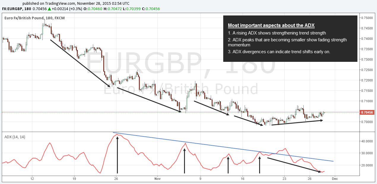
A rising ADX shows gaining trend strength
New highs on the ADX signal a healthy trend
Lower highs on the ADX signal losing strength
A “hook” on the ADX shows a sudden shift in trend strength
A flat or an ADX heading down signals a range
6) MOVING AVERAGES (MA)
THE RELATION OF PRICE TO THE MA AND THE SLOPE
Moving averages are a great trading tool because they provide a variety of different information at once.
First, the slope of a moving average is important. When the price is above the MA and the MA is moving up
it signals a strong trend with prices rising faster than the historical averages. The further price can pull away
from a moving average, the stronger the current trend is. The longer price can stay on one side of the moving
average without touching the moving average, the stronger the trend.
THE MA CROSSOVER – SENTIMENT SHIFTS
The combination of a smaller and a larger moving average measures sentiment shifts in price.
The screenshot below shows a chart with a 50 and a 100 MA. When the small MA crossed above the larger
MA it signaled a shift in sentiment to the upside because recent prices were moving above the average of the
longer term price structure. Conversely, when the shorter MA crossed the larger MA it signaled a sentiment
change to the downside because recent price started trading below the longer-term average.
THE SPACE BETWEEN MAS – MOMENTUM INFORMATION
Finally, the bigger the space between the two MAs, the stronger the trend is becoming because the recent price is
pulling away from the long-term average faster. The size of space between the two MAs provides information about
momentum. The MACD or the Ichimoku indicators are both based on the differences between short term
and long term average price structure.
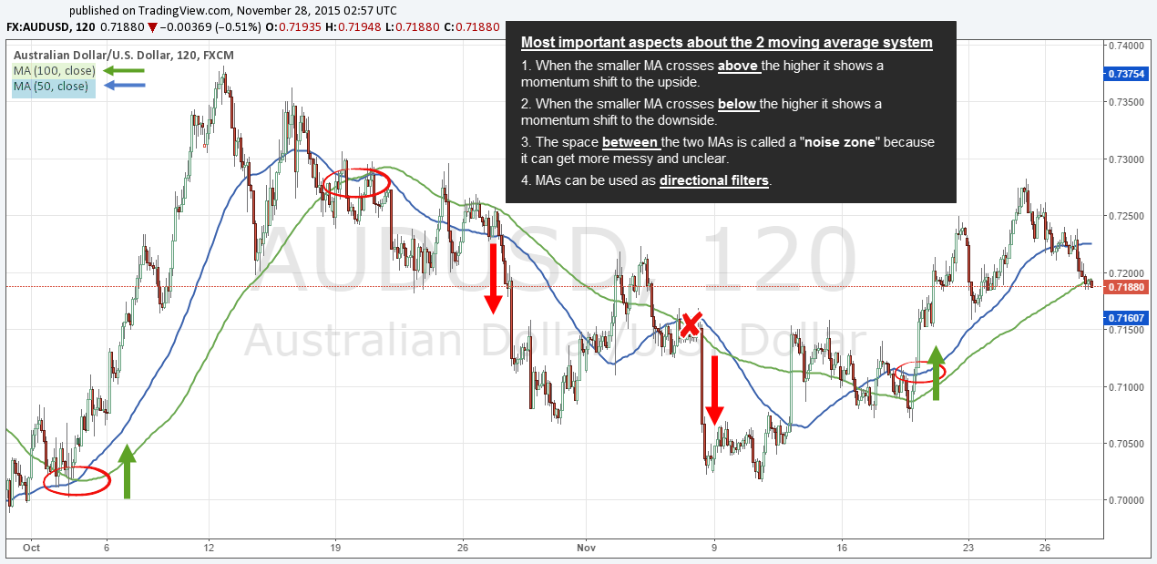
Generally, price above a moving average signals an uptrend [read about Marty Schwartz’s trading tips]
When the short-term MA crosses above the long-term MA, it signals a bullish trend shift
When the space between the two MA increases, momentum increases as short-term prices pull away fast from the longer-term average price
7) RSI
The RSI is another indicator that measures strength. It is similar to the ADX but the RSI is directional.
In a healthy uptrend, the RSI makes new highs and higher lows. In a downtrend, the RSI makes new lows and lower highs. In a range environment, the RSI moves sideways between 30 and 70.
The screenshot below shows that the first uptrend was initiated by an RSI divergence (higher lows on the RSI and lower
lows on price – a momentum divergence). During the following uptrend, the RSI made higher highs and higher lows.
After the uptrend, price moved down for a while but not with a lot of strength and the RSI stayed mostly between 30 and 70
(dotted arrow). The next uptrend-phase also started after an RSI divergence and the RSI started making higher lows again until,
just recently, another divergence signaled the end of the uptrend.
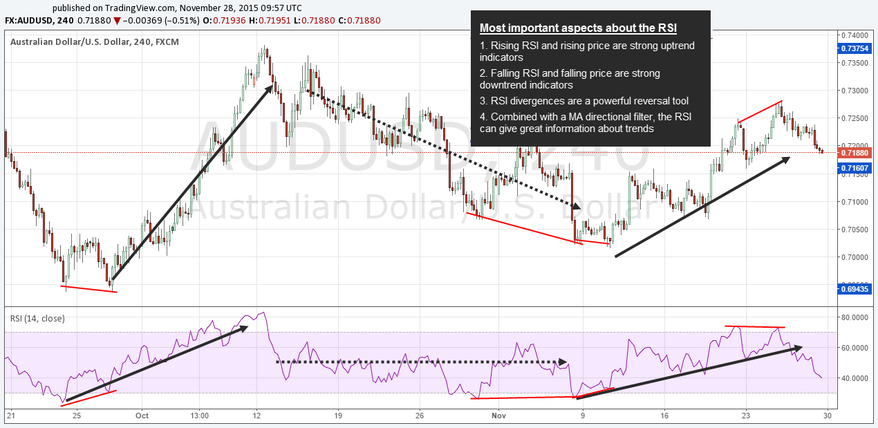
During an uptrend, the RSI makes higher highs and higher lows
A flat RSI ranging between 30 and 70 indicates a lack of momentum
An RSI divergence shows a momentum divergence and it is often a reversal sign
8) BOLLINGER BANDS
Bollinger Bands® can be combined with other momentum indicators but they are also a great tool for themselves.
The screenshot below shows a healthy uptrend and the Bollinger Bands® showed that as price stayed above the middle Band;
price “grinding” higher between the middle and the outer Band is a typical trend signal.
A trend is usually broken once price crosses the middle Band. A price spike outside the outer Band which immediately
reverses back into the Bollinger Bands® can often signal a change in trend direction.
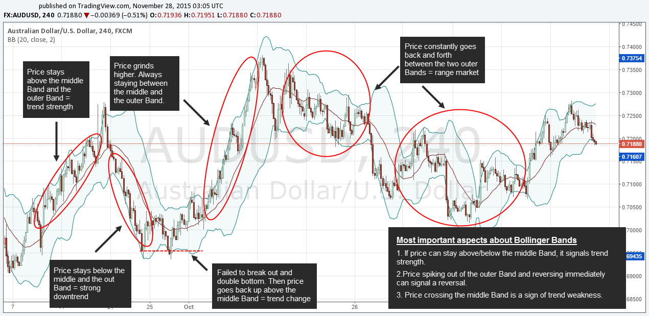
In an uptrend, price moves higher between the middle and the outer band
A break of the middle band often signals a trend reversal or the lack of momentum
A price spike through the outer bands and an immediate reversal indicates a sentiment shift
KNOWING THE STRENGTH OF A TREND IS THE BACKBONE OF ANY TRADING METHOD
Understanding trend strength and being able to read the balance between bulls and bears is a very important skill every trader has to develop.
And although each of the 6 described tools and concepts can be very helpful, you should pick 1-2 to avoid confusion and indicator redundancy.
The trading tools and concepts described are not a standalone system by themselves, but they should build the backbone of any trading methodology.


இந்த நான்கு Point போதும் Market Direction Predict செய்ய (youtube.com)


![]()
Wait until 9.30 am
60 to 100 points

High 17385 fist 15 mins
this is within resistance 17400
then you see red candle
Kc bollinder lower end as target
Sell call and buy put
60 to 100 profits
25 or 30 points stop loss

Sell put 16800 and SL 10 points
Keltner channel bollinder band
You will see upside momentum only after 1PM in NSE
|
|
|
|
|
|
|
|
|


(83) Option Active Contract Analysis (Part-1) - YouTube
